Case Study #1
Global foundation with an outdated website
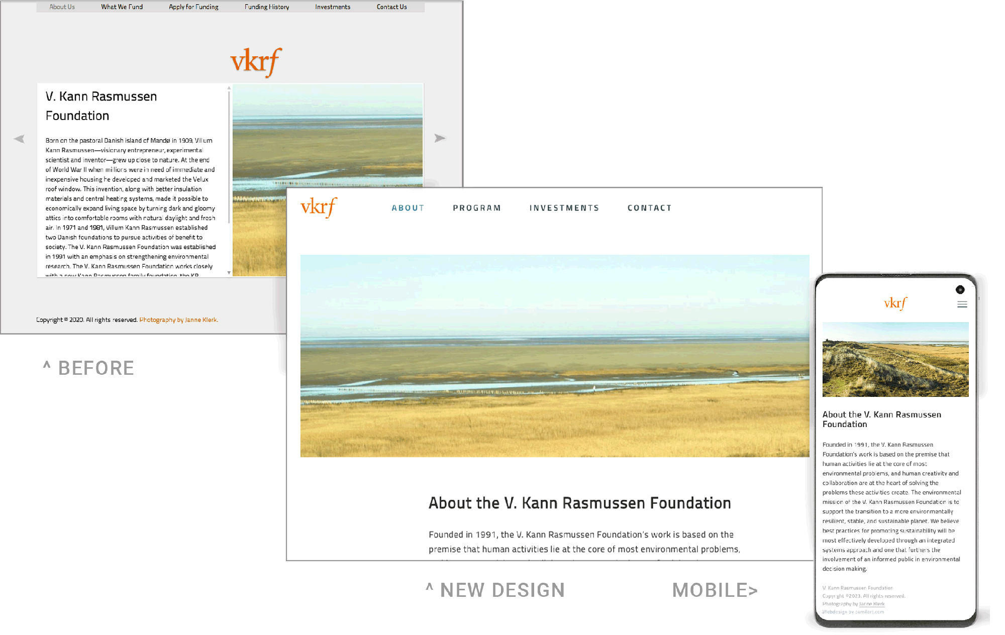 BEFORE and AFTER the redesign.
Problem:
vkrf.org website was dated, difficult to navigate, and at odds with current conventions in navigation:
– website not designed to work on mobile.
– navigation was partly located in the menu (tabs), but most pages required that you also scroll sideways.
– trying to find all the information led to frustration and lost time.
– topics were combined that were not logically related, some were duplicated.
– the custom photography is an important part of telling the story of natural environments, yet photos were cramped with little room.
Method:
1) Simplify and organize content for a better user experience.
2) Mock up site in figma and test the architecture and ux before building out the new design.
3) Develop clean visual style: spacious, minimal, allowing landscape photographs to have the desired impact. Subtle colors and font arrangements. Kept the same typeface, because I really like them; no reason to change what is already working beautifully.
Result:
• Modern minimalist website
• Functional: user friendly and easy to navigate
• photos are used to full effect
• mobile friendly
• PDF forms (downloadable from the site) follow the new style.